Overview
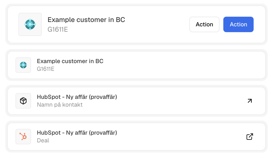
ObjectCard displays domain and resource objects in a consistent format. Pass anInly.Core.Data.ObjectData object and the component automatically renders the avatar, title, subtitle, and link. You can optionally add action buttons.
Basic Usage
Pass your object data to thedata prop. The component handles all rendering automatically.
Adding Actions
Use theactions prop to display buttons on the right side of the card.
Reference
Props
Object data containing title, subtitle, avatar, and URL.
Action buttons displayed on the right side of the card.
Card padding size:
sm (compact) or md (standard).Additional CSS classes to apply to the card.
ObjectData Structure
The component uses these key fields fromObjectData:
- title / subtitle — Primary and secondary display text
- avatar — Avatar data for visual identification
- url — Makes the card clickable (internal navigation or external link)
- type / id — Object identification