
Object UI Components

This document provides examples for the object UI components that work with Inly.Core.Data.ObjectData. These components are Level 2 abstractions that provide consistent UI patterns for displaying object data across the application.

ObjectCard

A card component that displays object data with optional actions.
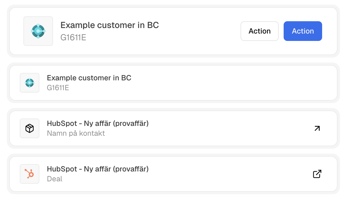
 ObjectCard Example
import ObjectCard from '@/core/components/object-card';

// Basic usage
<ObjectCard data={userData} />

// With actions and size
<ObjectCard
  size="sm" // sm|md
  data={userData}
  actions={
    <div className="flex gap-2">
      <Button variant="outline" size="sm">{__('Edit')}</Button>
      <Button variant="destructive" size="sm">{__('Delete')}</Button>
    </div>
  }
/>
A detailed link component that displays object data with avatar, title, subtitle, and optional link icon.
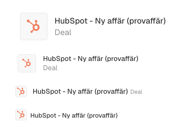
 ObjectDetailedLink Example
import ObjectDetailedLink from '@/core/components/object-detailed-link';

// Basic usage
<ObjectDetailedLink data={userData} />

// With link icon (arrow for domain objects and external link for resource objects)
<ObjectDetailedLink
  data={userData}
  showLinkIcon
/>

// Different sizes
<ObjectDetailedLink data={userData} size="xs" />
<ObjectDetailedLink data={userData} size="2xs" />
<ObjectDetailedLink data={userData} size="md" />

Sub components

Some object related low level components that may be useful for some more “custom” use cases.
  • ObjectAvatar: renders the avatar incl. support for icon and hue fallback.
  • ObjectLink: renders an Inertia link for domain objects and external link for resource objects, if an URL is provided.